I’m biased, but I like Minnesota for a lot of reasons. The weather is nice (4 months of the year). The fishing is pretty good. The air is clean and the people are the nicest I’ve ever had the pleasure to deal with. I also like that fact that we Minnesotans like to ‘keep it simple‘.
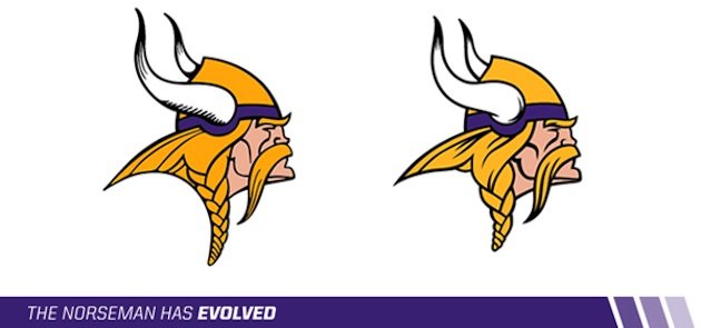
Case in point, the new Minnesota Vikings logo. It doesn’t look new. Can you tell any differences? It’s like scanning over the Norseman as if we were trying to find Waldo. The team calls it an ‘enhancement’. So yes, respect to them for not saying it’s a full blown new logo.
Living in Miami, I’ve learned the Dolphins decided on a new logo…we think. A leak of the ‘new logo’ prompted a cry for new logo designs. In response, 27, 681 logos came flying in for review. Miami Herald readers even picked a winner.
In Miami, there’s a media leak, an outcry, confusion, a stadium debate (wait, Minnesotans had that)…the list goes on. In Minnesota, just an enhancement. Simple. Miami did win a Super Bowl (two actually). I digress.

So what’s new, anyway? Yahoo helped break it down:
1. Horn Shape: The shape of the horns has been adjusted and the shading in the horns has changed.
2. Horn Base: The base of the horn now resembles the horn on the players’ helmets.
3. Face Detail: Thicker lines have been added to the mustache and face.
4. Vikings Gold: The Vikings Gold is now brighter and less brassy.
5. The Braid: The braid has been shortened, resulting in a reduced logo height.
This actually makes a lot of sense moving into a new stadium in 2016. 100% of the logos around the city won’t have to be replaced. No one will notice now if they’re not. Look at the Minnesota Twins logos over the years. They’ve changed a few times and you can definitely differentiate the differences and determine which logo represented each period of time.
New logo or not, it won’t help the team. That requires more than Photoshop. So hopefully the front office will put in some serious OT and acquire some players to help us make it to the big game – something that hasn’t happened in almost 30 years.
I’d say we’re due. Hey, at least we’ll have a shiny new logo to show off on Super Bowl Sunday.
